Embedded Checkout in Your Brand: esenda for EdTech Partners
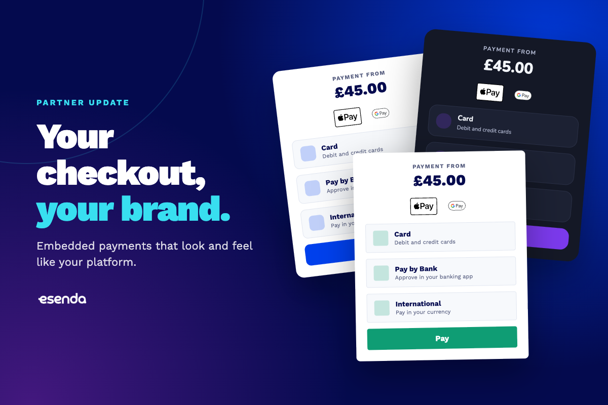
Your checkout, your brand: esenda’s embedded checkout now adapts to every partner
esenda’s embedded checkout can now take on more of your platform’s look and feel. Partners can set their own colours, fonts, spacing, corner style and dark mode, so paying feels like part of their product. Every theme is automatically checked for accessibility, and Pay by Bank and international payments are available in the same embedded checkout.
For an edtech platform, the moment a parent pays is one of the most important in the whole journey. If the payment step suddenly looks different from the rest of your product, it creates doubt at exactly the wrong time.
That’s why we’ve built a new way for partners to make the esenda checkout their own.
What’s new in esenda’s embedded checkout?
Our embedded checkout is the payment experience partners place inside their own platform. With this update, it can now match your brand, and it supports more ways to pay.
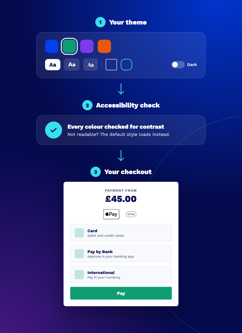
Your brand, throughout. Partners can send us their theme settings: primary colour, font, spacing, corner radius and dark mode. The checkout adapts instantly, so every payment looks and feels like your product.
Accessible by default. Every colour combination is checked for readability against its background. If a theme wouldn’t be readable, it’s rejected and the checkout loads in its default style instead, so no parent is ever left with a payment screen they can’t read.
More ways to pay. Pay by Bank and international payments are now available inside the embedded checkout, alongside card and digital wallets. International families see the amount in their own currency before they pay.
Why does a branded checkout matter?
Trust. Parents are cautious about where they enter payment details, and rightly so. A checkout that clearly belongs to the platform they already use feels safer than one that looks like a hand-off to someone else.
Completion. Every unexpected change in a journey is a reason to hesitate. When the checkout looks and feels consistent from first click to confirmation, more payments get completed first time.
A product that feels whole. Your platform is the experience schools and families know. A branded checkout makes payments a seamless part of it, rather than a bolt-on.
Every checkout can feel different
No two edtech platforms look the same, and their checkouts shouldn’t either. A catering app, a booking system and an MIS each have their own style, and the esenda checkout now adapts to each of them.
Behind the scenes, it’s the same secure, education-specific payments infrastructure: the same payment methods, the same reconciliation and the same support. On the surface, it looks like you.
That’s how we think about partnership: we handle the payments complexity, and you keep ownership of the experience.