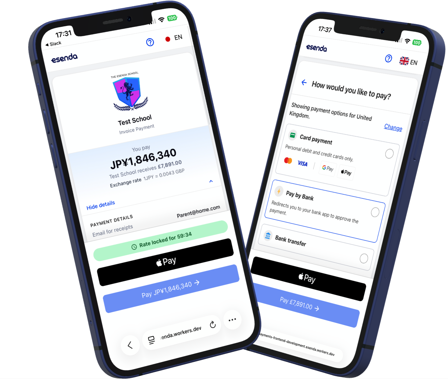
Why a clearer payment journey matters for parents
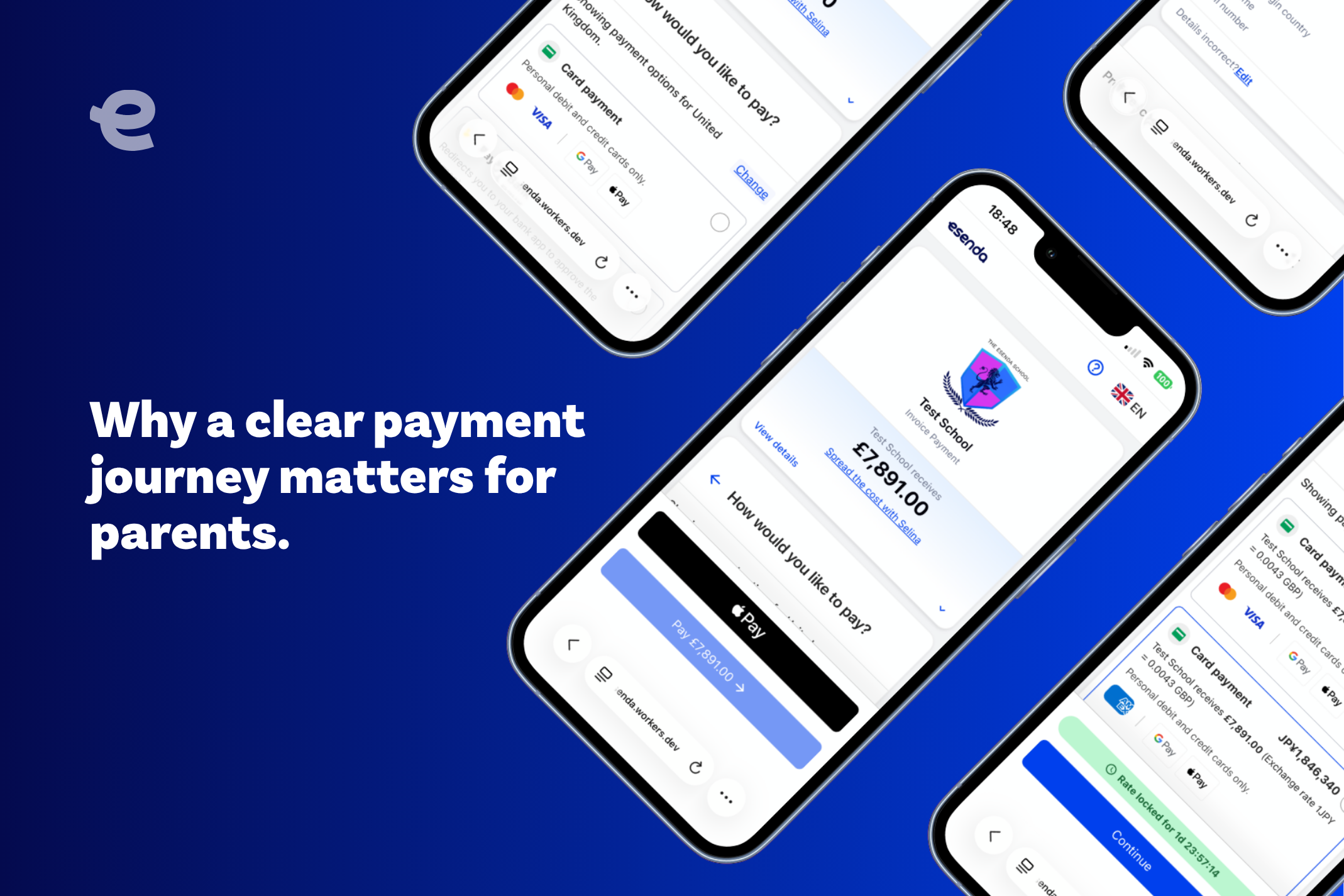
The parent journey is shaped by more than admissions conversations, school visits and day-to-day communications. Payment is part of that experience too.
It is one of the moments when a parent needs clarity: what am I being asked to do, what options are available to me and what happens next? If the journey is difficult to follow, even a straightforward task can create unnecessary uncertainty.
Good payment UX is genuinely helpful
A well-designed payment journey should not demand extra effort from the person using it. The structure should feel obvious, the language should help rather than slow them down, and the available choices should be easy to understand.
That matters particularly when families may approach school payments in different ways. Presenting the available options clearly helps parents understand the routes in front of them and make an informed choice without needing to decode the process.
Designed for the devices parents already use
Parents increasingly manage important tasks from their phones. A journey that works well on a large desktop screen can still feel awkward on a smaller device, particularly when it involves several stages or choices.
Mobile experience is therefore not a finishing touch. It is part of making the payment journey accessible and practical in the context in which parents actually use it.